
The Design Challenge
The question came form our product people and Design System team in Bukalapak in early 2019.
While Bukalapak is trying to kickstart their design system infrastructure, conflicts are happening between the consumer-facing product and the merchant / mitra-facing product. Debates happening due to both team feel like the design system isn’t working well for the users. Libraries and components are constantly improved ad-hoc, and resulting in confusion in front-end development
Research team investigates the issues to the more non-savvy users to understand their digital saviness and understanding of our design components, while helping the Ops team strategizing their education for digital adoption
The Research Approach
Research insights are aimed to function more as foundation for decisions, and also rationale for the design system set up across the company. Research needs to answer these two basic question:
- What’s wrong with the current single design system among the low-end segments?
- What are the gaps from our current design system, and how we can empower them better with our design?
With minimal context and direct observation within our repositories, we decided that field visit is the best way to answer these questions.
Research team then brainstorm with the product and ops team together to get a better sense on how we should segment Bukalapak’s Mitra / partners. We try to represent the partners from different cities (as they have different habits, and ops strategies across different region is also different), and also from the various business size that these partners have.
We end up talking with 12 partners in one city, and choose a home-visit as our main method. The goal for this: is to really understand their life context, their digital adoption in their daily lives, as well as to have enough space for them to interact with our cool paper-based research toolkit:
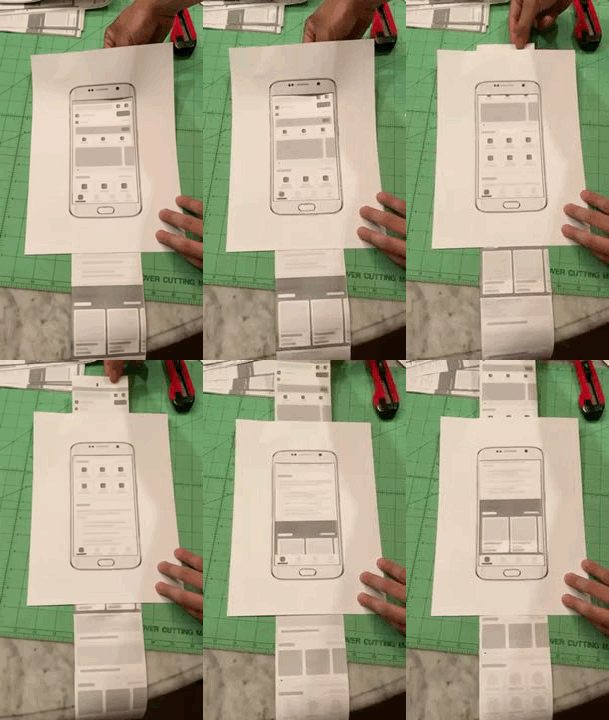
Whoa, what’s with that paper smartphone layout?
As you can see, we put all the available components, pages, and also icon placeholders there. We then give out this paper prototype for them to guess, what could be the feature / functionality that are represented with the components. This is done to answer the first research objective of actually auditing the available design system, to really see whether it’s working well with this particular segments.
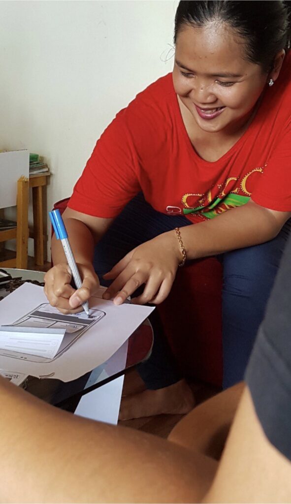
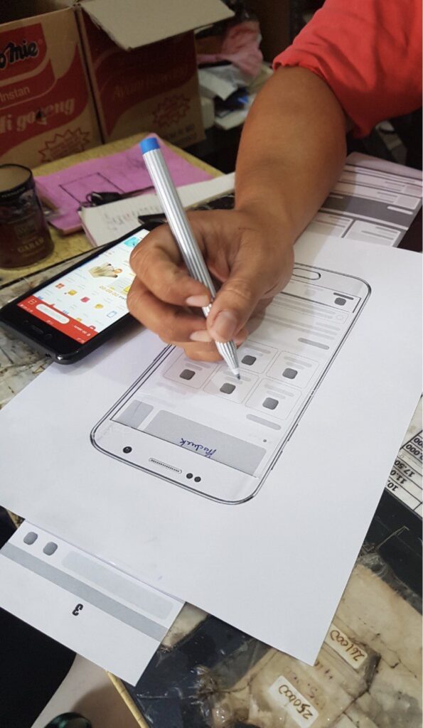
The participants enjoyed the activities too:
The Impact
We came back from the field with enough evidence that the design system we have at the moment doesn’t really resonate well with our target segments’ familiarity and references. What’s better is: we also know which components and pages drive the most confusion.
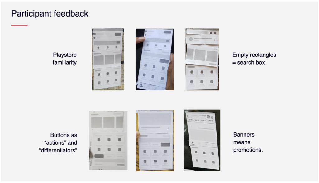
We also figured out that there are two attributes that drives the users’ association of certain components with expected features: Familiarity of their first apps they use. We kind of realized that these segments are pretty much new in using smartphones. The smartphones options that they have are also very limited to the brands and variants which are very low-budget and entry level. This drives the design of the UI a bit different with the stock Android phones we found on the general market.
We brought this insights to the design team and kicked off a project of benchmarking design based on these entry level smartphones, in order to create the best design system for these users.